An admirable idea

So scrolling through my Twitter feed this week, I saw a link that caught my attention. It was tweeted by @Designtaxi, an account that tweets a lot about design, photography and pop culture.

A group of communication design graduates started a program where they take pictures drawn straight from the imaginations of children, and bring them to life in a illustration. (I’m pretty sure some groups have taken this even further and will make a stuffed animal of the child’s creation, which is super cool too).

The article says it was “Named the ‘Monster Project’, the team hopes to ‘help children recognize the power of their own imaginations’ by showing them how their drawings can spark new ideas among artists.”

This is a really neat idea. It truly shows kids what they are capable of, and is urging the younger generation to think in visual ways. We need this. Society needs a continuing crop of young people who think and imagine and create on their own terms and aren’t afraid of boundaries. I think if this project inspires one kid to grow up and become a designer or illustrator, then it has done a good thing.

I know as a kid I would have loved this. Now as a designer myself, I have kind of self-challenged myself to find an illustration of a monster made by a kid, or even one of my old drawings, and illustrate it. I want to see what I’m capable of. (So everyone stay tuned 🙂 )

Check out the project for yourself here: http://gomonsterproject.com/

Album design

So in honor of one of my favorite bands, Walk the Moon, releasing their new album today, I thought I’d talk about its design. Take a look below:

Screen Shot 2014-12-02 at 8.18.55 PM

First off, I love the use of the color yellow. It really conveys the happy nature of the album and a nice light feeling. With that being said, here are three design principles they used well.

  1. Point: I feel like their four head placed in a square formation reminds me of four points of the square. Point refers to dots used to create a cohesive feeling in a design. I think having them all differ by a little bit is a nice touch though, allowing it to show personality of the band members.
  2. Continuation: This kind of builds on the idea of the four heads creating a square. They way they are positioned allows the viewer to make a connection that it was intended to be a square. The viewer can then continue the points and make it into a square in their mind.
  3. Similarity: The four people pictured are all in similar clothes and positioned in basically the same way. A grouping like that lets the viewer know they are all related and encourages him/her to regard them all as one group instead of four individual people.

So through using strategic design principles, Walk the Moon put out an album design that accurately reflects their status as a band and the ideas behind the album itself.

Musings on design

This blog is about design, an integral part of the print publication industry. But as all journalists know, the industry is undergoing rapid change. And design is not immune. In fact, the design aspect probably has some of the hardest obstacles to overcome.

Design has to grab people’s attention. Not many people are interested in a physical copy of the newspaper any more. (Magazines are a different story.) So design has to offer something different from what people will have already found online.

Even if this means withholding some information from the original online story, I think it’s worth it. Just enough information for an infographic that goes into print but not online will do the trick.

However, if that is not an option its possible to use what was already online to present the package differently. Online, the user can decide what is most important. Take for example an image gallery. The viewer online can view pictures as they choose. In print, the designer chooses which pictures run.

These are good for different reasons. When a viewer can decide what to view it leaves them feeling in control. When a designer chooses which pictures run prominently in the paper, they decide for the viewer what might be most important.

In combination, I think the print paper accompanied by an online supplement (allowing designers/writers to show what is most important but also allowing viewers a chance to do so themselves) is a great system. As long as the print stays around.

That’s a wrap

So, as of this past week my design class has wrapped up. I was so excited to enroll and be in my first design class and it didn’t let me down. We learned a lot about both publication and digital design that I know I will be able to carry with me down my career path.

We just recently had to turn in our final project, a redesign of a magazine of our choosing. I kind of did the assignment twice to decide which option I liked better. The first time around I redesigned the Smithsonian magazine and did two spreads with a story on Virunga National Park. It is the oldest national park in Africa and is home to many gorillas. However, it is threatened by poachers, oil drillers and generally poor interests. The chief warden does great work trying to stop this and protect the park.

The design I did was clean and photo-based. Of course it had the main story in there, but there was mainly photos as accompanying art. I did make an small infographic that focused on showing where Virunga is in Africa, but mainly photos helped tell the story.

The second redesign I did was based on a deer story in Missouri Conservationist magazine. I think this one was more in need of a redesign. Theirs definitely looked clean and professional, but to me it didn’t evoke the most sophisticated response. In my redesign I tried to make things less boxy and young looking. I did this by removing the large blocks of color used for pull quotes and adjusting the typography from a thick, blocky sans-serif font to a thin, modern sans-serif font. That seemed to help a lot.

To focus on content-driven design I made an accompanying infographic. It was an arrow that served as a timeline to show when the different deer hunting seasons began. I thought it was a neat way to convey the information; one section in the infographic specified archery season, so the arrow tied in nicely.

Everything I learned throughout the semester culminated nicely in my final project. I was definitely thrilled to be enrolled in this class and I can’t wait to move on to my next design class in the spring.

Moving forward into the digital world

So in my most recent design classes we have been learning coding using HTML and CSS language. This is an expansion of what I learned in my weekend class from last month on the Adobe program Dreamweaver.

I surprisingly enjoyed doing the coding for web design. There was something methodical and logical about it that I really enjoyed. I like the HTML/CSS language.

A couple semesters ago I took a computer science class. It was just a basic, intro course. I thought that taking a CS course would be really beneficial for the way print news is moving into the digital world. While I still think I learned some important skills, the language was much more difficult. In that class we learned Python. It is a different language that was hard to write. If one little thing, like a mismatched capitalization or misplaced comma, was wrong then the whole code wouldn’t run. HTML/CSS is not like this. It at least provides you with a visualization of what is wrong so you have an idea of how to fix it.

However, that does not make it any less frustrating when your code isn’t working out as planned. With the visuals, yes you can clearly see what is wrong but it’s annoying when you can’t figure out why. I also like the flexibility offered by HTML/CSS. Since you write the code yourself, you are free to make the design however you want.

I’m still playing around with it and mastering the fundamentals, but I’m really glad I’m finally delving into the world of coding. With my interest in print design, knowledge of HTML/CSS is definitely a necessary skill to have to keep up with the modern, rapidly changing field of journalism.

I’m a design nerd

So the other day I was browsing Twitter and I came across more Twitter accounts that I had to follow. I want to share some with you all because I think they are more than just a starting point, like the ones I shared with you on my first post.

@InDesign

I didn’t realize that each of the Adobe programs were on Twitter. But they are and it’s pretty cool. I only listed here the one for InDesign because that is probably the program that is most useful to me, but Photoshop and Illustrator are the other two I know are on Twitter for sure. This is really cool because they share tips on a daily basis. For someone who uses InDesign frequently this pretty awesome. The accounts are all really responsive to mentions and tweet back at their followers, which is really cool

Here are just a few more InDesign twitter accounts that tweet helpful tips and tricks. Here are a few: @indesignsecrets and @indesignmag. There’s a lot of other accounts dedicated to the other programs and that share cool and helpful content as well. The best part is finding them and seeing what you can learn. Get out there!

Morgan runs on coffee

This is not a groundbreaking announcement for a college student. But this week I feel is going to be particularly helped along by my daily dose of caffeine.

As a designer, I would be remiss not to address the vessel that helps the coffee get from point A to point B: the coffee mug. I personally have a collection of coffee mugs, some that I like better than others. Some are also prettier and better designed than others. However, all serve their purpose.

I am also not the only person to ever address the styles of coffee mugs. My post is inspired in part from another post from the site Design Milk, which is devoted to everything design. The list shares some mugs designers from the group Society6 have made. (Also I feel like the last mug holds true for a lot of journalists). Here I will discuss some of my own favorite mugs. Also, please keep in mind I did not purchase any of these for their aesthetics in the first place so they are not in any way modern marvels of coffee mug design.

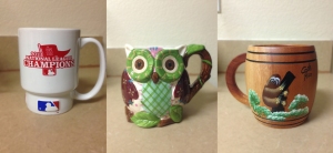
mugcollage

Left: Cardinals mug. Definitely beloved because it representative of my favorite hometown sports team. It is a clean white with logos strategically placed on either side of the mug. Very simple in design but also very effective.

Middle: The Owl mug. This one is doesn’t use any strong design principles per se, but in general is just cute. I do enjoy the colors and the shape and how this distinguishes it from many other coffee mugs. I probably also enjoy it because it is huge and delivers a lot of coffee per mug-ful.

Right: Sloth mug. If anyone knows things about me they know I like sloths. So the fact that this one features a sloth and is actually from Costa Rica makes it pretty cool. It does utilize design principles like the lines around the top and the bottom to give it a dynamic appearance.

Honorable mentions: I have several other mugs that don’t get the privilege of being pictured here today.

  1. Vespa mug. A friend got me a mug from Italy that features a single red Vespa scooter as the only image. Similar to the Cardinals mug, its simplicity is what makes it effective.
  2. Yellowstone mug. I got a mug from Yellowstone National Park when I was in sixth grade that has my name on it. On it are all the animals from the park and features of the park like Old Faithful. It also says Morgan across the top. It’s pretty busy but I like it for what it represents.
  3. My Truman State University mug. I obviously don’t go to Truman State, but one of my best friends does and this was a present to me. It features the Truman State logo of a purple bulldog as it’s singular image. I like it because the logo is purple (my favorite color) and it is also very simple like my other logo mugs.

FYI I do have a Mizzou cup of course. I don’t include it here because it is actually a tumbler and doesn’t have a handle so I don’t truly consider it a mug. But that’s a different topic.

Lastly, I want to show a product I found last night while thinking about this blog post. I stumbled upon another Design Milk post about modern reading essentials. The post also addressed the need for a good coffee mug and featured Pantone mugs. For those not familiar, basically Pantone is a color system that allows designers to color match specific colors in a design. So when I found these sets of mugs I thought they were pretty cool. I particularly like this mixed blue set of Pantone mugs.

Design in mugs puts a log of emphasis on one single element. Whether that is a logo on a white background or just a single theme, like forming the mug into an owl, simplicity seems to be important. This is a little bit of a generalization because there are so many coffee mugs out there, but that’s the conclusion I have drawn from my small collection of mugs.

So those are my personal thoughts on coffee mugs. Do you have a favorite coffee mug or maybe one you’ve seen lately that you want? (Buzzfeed just posted a list about mugs as well: 26 Genius Mugs You Need To Drink Out Of Right Now”). Let me know your thoughts in the comments!

My weekend class taught me more than Dreamweaver

This past weekend I attended a class that covered how to use the Adobe software Dreamweaver. Dreamweaver uses HTML and CSS coding to build websites. When I had to pick a one-credit hour weekend class to round out my semester, I thought this one would be interesting. It piqued my interest because it involves planning and designing to create a web design.

So over the course of Saturday and Sunday, I learned how to use some HTML and CSS to make basic websites. I now know how to build the framework of a site, make navigation bars, change the colors of pages, insert pictures and more. By the end of the weekend, I had two functioning websites with multiple pages to navigate to.

I’m not sure how widely Dreamweaver is used in the web design industry, however. I don’t see a lot about Dreamweaver in general, so I think a lot of businesses or publications use other content management systems that might be more user-friendly or allow for more options. I do think what I learned in this class will apply across systems.

For example, working on signing up for classes next semester, some of my options for courses are web design classes that utilize some HTML and CSS coding. The basic skills are the same and transferrable to other areas and very helpful when entering the job market. The more skills any one person has to offer a potential employer, the better.

That was another reason behind why I decided to take this class. I had known for a while I wanted to learn some basic coding so I could have more skills and be a better designer. I even took a basic computer science class a few semesters ago to learn some coding as well.

In my case I think it is important to develop as many design skills as possible. Considering how dynamic the journalism industry is right now, this is especially important. Learning about programs related to computers and digital journalism is key.

I hope to further polish my web designs in the future. My goal is to keep up with the changing times of journalism and one important way to do this is to stay educated.

When sports and news design collide

So my primary interest in the design world is print design. This is no secret. I enjoy seeing beautiful front pages, dynamic doubletrucks and just overall clean design.

On a separate note, I also really like sports. So being in Missouri at a time like this, with both baseball teams in the playoffs, is really great. I can watch the drama of the sports world unfold on the front pages of the state newspapers. I am from St. Louis, so I am naturally a St. Louis Cardinals fan. I usually look to the St. Louis Post Dispatch.

On the front of today’s Post Dispatch, they moved the flag down the page a bit and placed a photo of last nights Cardinal loss at the top, captioned “On the Brink.” Inset, they have a smaller photo showing a celebration shot from the Kansas City Royals because they are now ALCS champs and headed to the World Series.

I think the design is really clever, but maybe not executed extremely well. I like that there is good contrast in multiple aspects of the photo combination. There is a contrast of emotion, between the Royals celebration and the Cardinals’ gloom. I like the idea of an inset image, but I think in this case with the picture and the headline on the top of the photo and surrounding the action, it becomes too messy.

From the other side of the state, The Kansas City Star featured one dominant (almost poster-sized) image, with the headline “World Class.” This design is really simple but pulls off the message very well. They let the image speak for itself.

The Post Dispatch had an additional design dedicated to the Cardinals on the sports front, with the punny headline “Blunder-ful.” With a one word headline, and not using a deck or inset picture in addition to the dominant image, I think the sports front page did a better job in conveying the feeling of disappoint following the Cardinals’ loss.

Our own Columbia Missourian featured a sports front dedicated to the Royals. I really liked this page because it was simple and featured the two small yet moving words: “At Last.” The photo also took up all the above-the-fold space, from one side of the page to the other, leaving no blank margin space. I think this gave the page a classy feel and emphasized even more meaning of the win.

Out of all three designs, I like the Missourian’s sports front the best. I think the short headline with the dominating photo showing the emotion of the moment is the best way it could have been done. The Star’s page was good and showed a great group celebration shot, but the photo the Missourian staff chose seems to easily sum up the fan base’s feelings in one person. As for the Post Dispatch, if the Cardinals had pulled off a winner last night then there would have been better design opportunity there. It would have been inappropriate at the Post-Dispatch to feature a dominant photo the size of the Star’s photo featuring the disappointing loss, especially since the Cardinals aren’t out of the series yet.

Sometimes it is necessary to have complicated design to communicate a difficult message. However, in most of these instances, the sports photos can speak for themselves with minimal design effort.

blogpic

4 design Twitter accounts to follow

As a fitting first blog post, I want to talk about one of the easiest ways to learn about design and get involved in the design industry: following design Twitter accounts. I have been interested in design since the middle of high school, but I just recently started looking into design on social media. One night I went on a following-spree and I found several really neat design Twitter accounts worth following. In no particular order:


  1. @Coverjunkie

I really like this account because it features magazine covers from across the industry. One of my particular interests is print design so I like that Coverjunkie focuses on print covers. It allows designers new and old to see what design trends are going on in the industry and gain inspiration from these trends. Fashion magazines, newsmagazines, foreign magazines and everything in between have been seen on their social media accounts, so there is something for everyone.

Website: www.coverjunkie.com

  1. @ilovetypography

This is another blog I may be partial to due to my specific interest in publication design. I like that this Twitter features articles and new information on fonts. For example, only a couple of days ago they tweeted an article about a new font called “Questa.” I would never have known about the appearance of this new font without this account. They also have a cool thing where they do “This week in fonts” or “This month in typography” where they talk about what has happened in typography lately, which helps keep designers in the loop.

Website: www.ilovetypography.com

  1. @SND

This could be an obvious choice, but following the Society for New Design is a good way to keep up with the latest news in design. They tweet about workshops they are hosting and contests they’re holding. All this allows designers to get a real feel for the industry with an up front, hands-on approach. (PS- if you’re still in college, try to find your university’s account. Mine for example is @sndmizzou.)

Website: http://snd.org

  1. @SPDtweets

I think this account helps round out the others by adding a historical approach. While the Society of Pub Designers is definitely still alive and active, they often take a look back at previous design. Some of their previous tweets have addressed topics such as “What were the best designed magazines of the 60s?” or “Yes, this really is a magazine cover!”, addressing odd design from the ‘80s. It’s worth a follow just for the history of design it can provide in provide in 140 characters.

Website: www.spd.org


Those are just a few to get you started. There’s plenty of awesome design Twitters out there. What are your favorites? Let me know in the comments.

Create a free website or blog at WordPress.com.